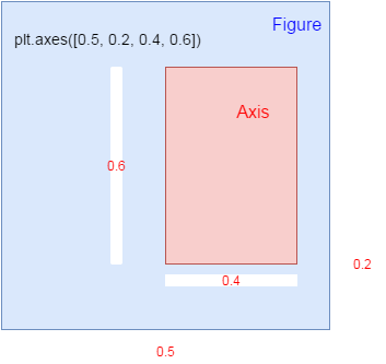
understand axis in matplotlib
axis is a subarea within figure() in matplotlib
figure()
plt.axes([0.3, 0.5, 0.4, 0.2])

the figure area size is 1, 1 as base
|
In [2]:
import matplotlib.pyplot as plt
import numpy as np
In [6]:
physical_sciences=[ 13.8,  14.9,  14.8,  16.5,  18.2,  19.1,  20. ,  21.3,  22.5,
        23.7,  24.6,  25.7,  27.3,  27.6,  28. ,  27.5,  28.4,  30.4,
        29.7,  31.3,  31.6,  32.6,  32.6,  33.6,  34.8,  35.9,  37.3,
        38.3,  39.7,  40.2,  41. ,  42.2,  41.1,  41.7,  42.1,  41.6,
        40.8,  40.7,  40.7,  40.7,  40.2,  40.1];
computer_science=[ 13.6,  13.6,  14.9,  16.4,  18.9,  19.8,  23.9,  25.7,  28.1,
        30.2,  32.5,  34.8,  36.3,  37.1,  36.8,  35.7,  34.7,  32.4,
        30.8,  29.9,  29.4,  28.7,  28.2,  28.5,  28.5,  27.5,  27.1,
        26.8,  27. ,  28.1,  27.7,  27.6,  27. ,  25.1,  22.2,  20.6,
        18.6,  17.6,  17.8,  18.1,  17.6,  18.2]
year=[1970, 1971, 1972, 1973, 1974, 1975, 1976, 1977, 1978, 1979, 1980,
       1981, 1982, 1983, 1984, 1985, 1986, 1987, 1988, 1989, 1990, 1991,
       1992, 1993, 1994, 1995, 1996, 1997, 1998, 1999, 2000, 2001, 2002,
       2003, 2004, 2005, 2006, 2007, 2008, 2009, 2010, 2011]
two methods to specify many distinct graphs¶In [10]:
# Plot in blue the % of degrees awarded to women in the Physical Sciences
plt.plot(year, physical_sciences, color='blue')

# Plot in red the % of degrees awarded to women in Computer Science
plt.plot(year, computer_science, color='red')

# Display the plot
plt.show()
In [8]:
# Create plot axes for the first line plot
plt.axes([0.05,0.05,0.425,0.9])

# Plot in blue the % of degrees awarded to women in the Physical Sciences
plt.plot(year,physical_sciences, color='blue')

# Create plot axes for the second line plot
plt.axes([.525,0.05,0.425,0.9])


# Plot in red the % of degrees awarded to women in Computer Science
plt.plot(year,computer_science, color='red')


# Display the plot
plt.show()
In [9]:
# Create a figure with 1x2 subplot and make the left subplot active
plt.subplot(1,2,1)

# Plot in blue the % of degrees awarded to women in the Physical Sciences
plt.plot(year, physical_sciences, color='blue')
plt.title('Physical Sciences')

# Make the right subplot active in the current 1x2 subplot grid
plt.subplot(1,2,2)


# Plot in red the % of degrees awarded to women in Computer Science
plt.plot(year, computer_science, color='red')
plt.title('Computer Science')

# Use plt.tight_layout() to improve the spacing between subplots
plt.tight_layout()
plt.show()
In [ ]:
|